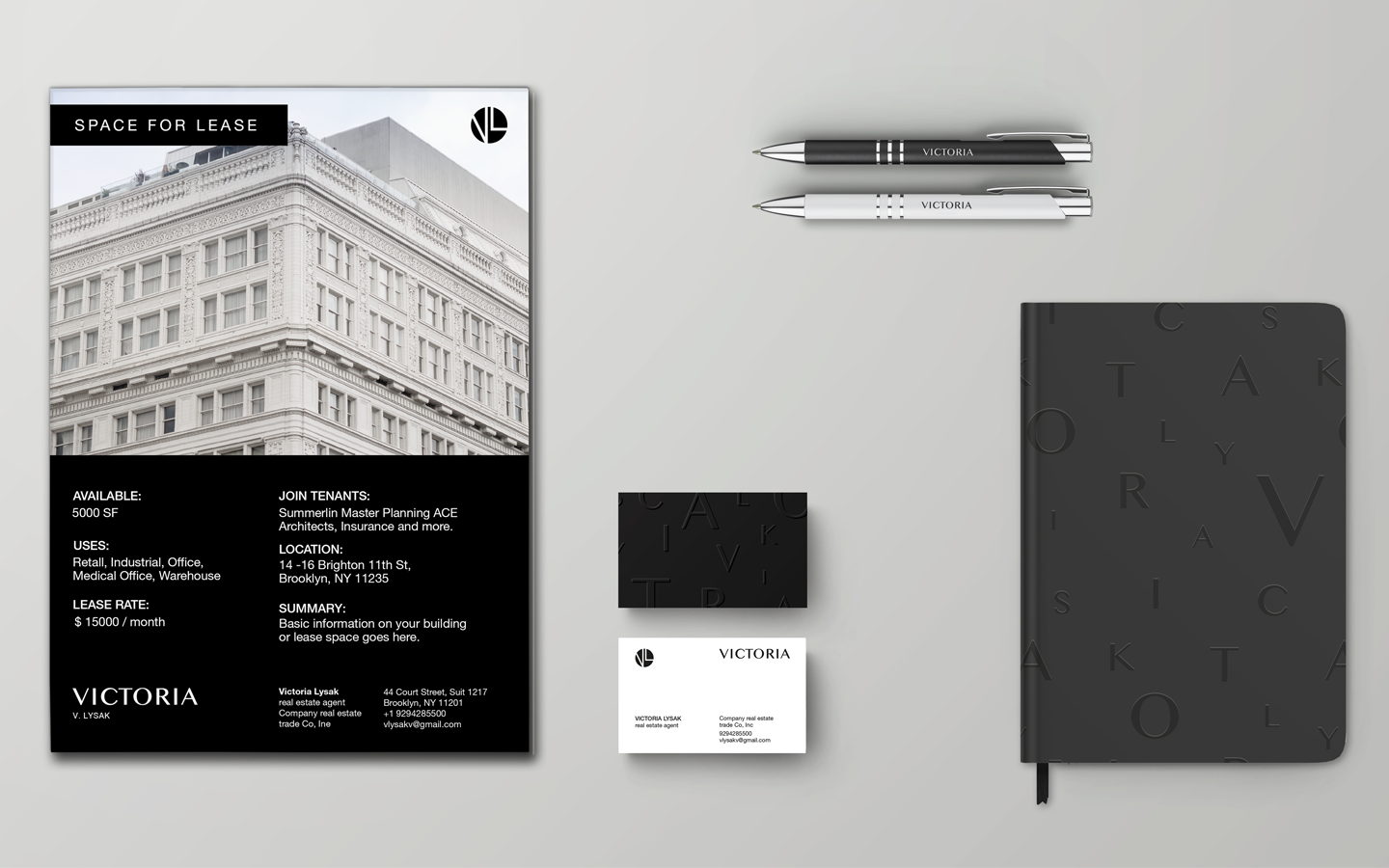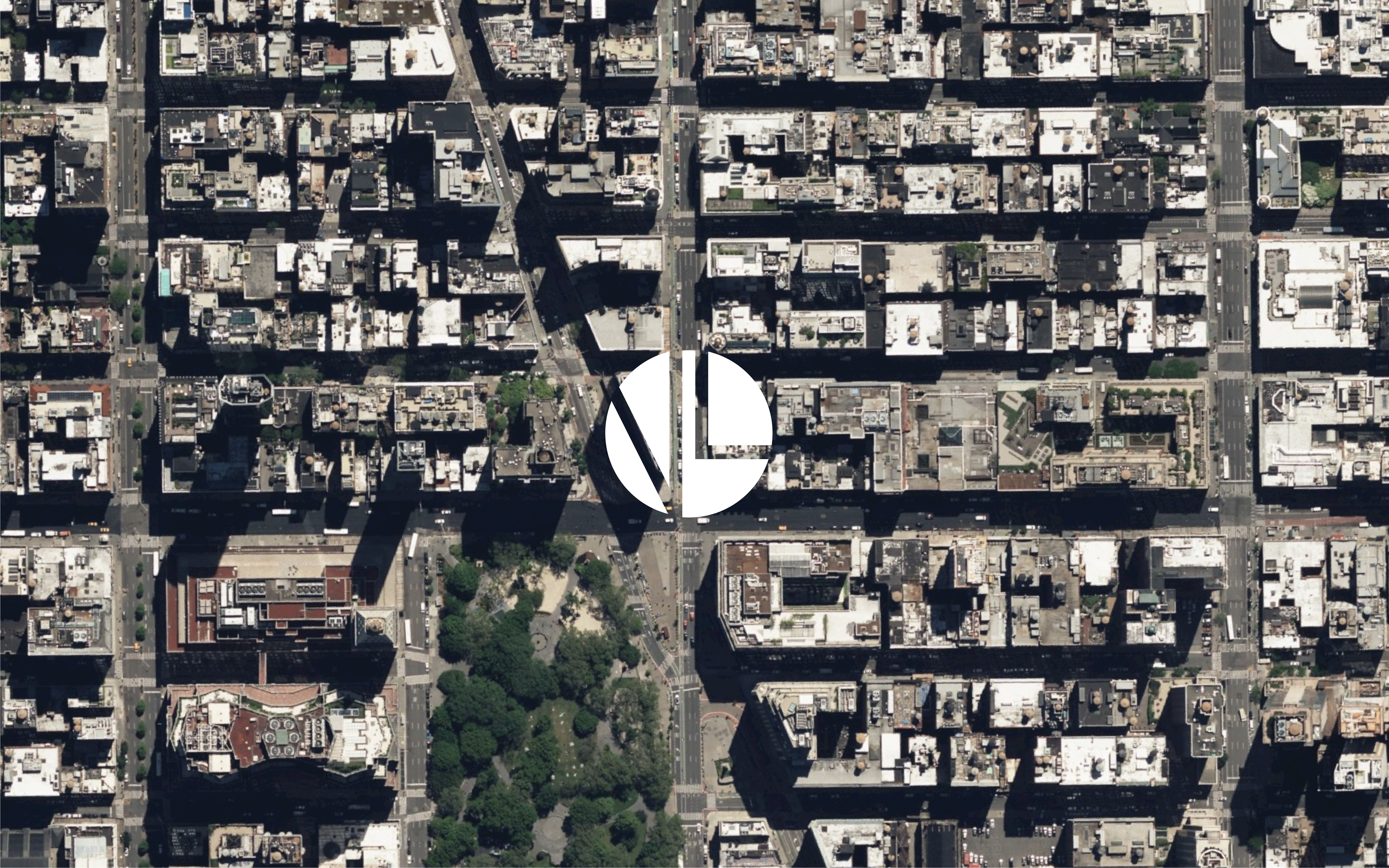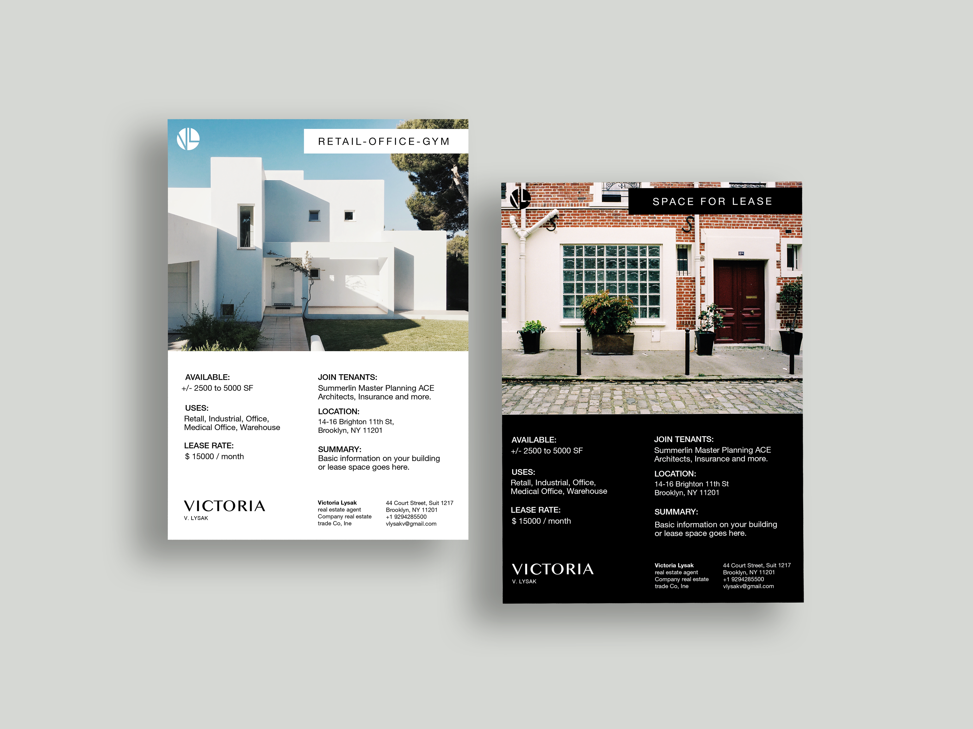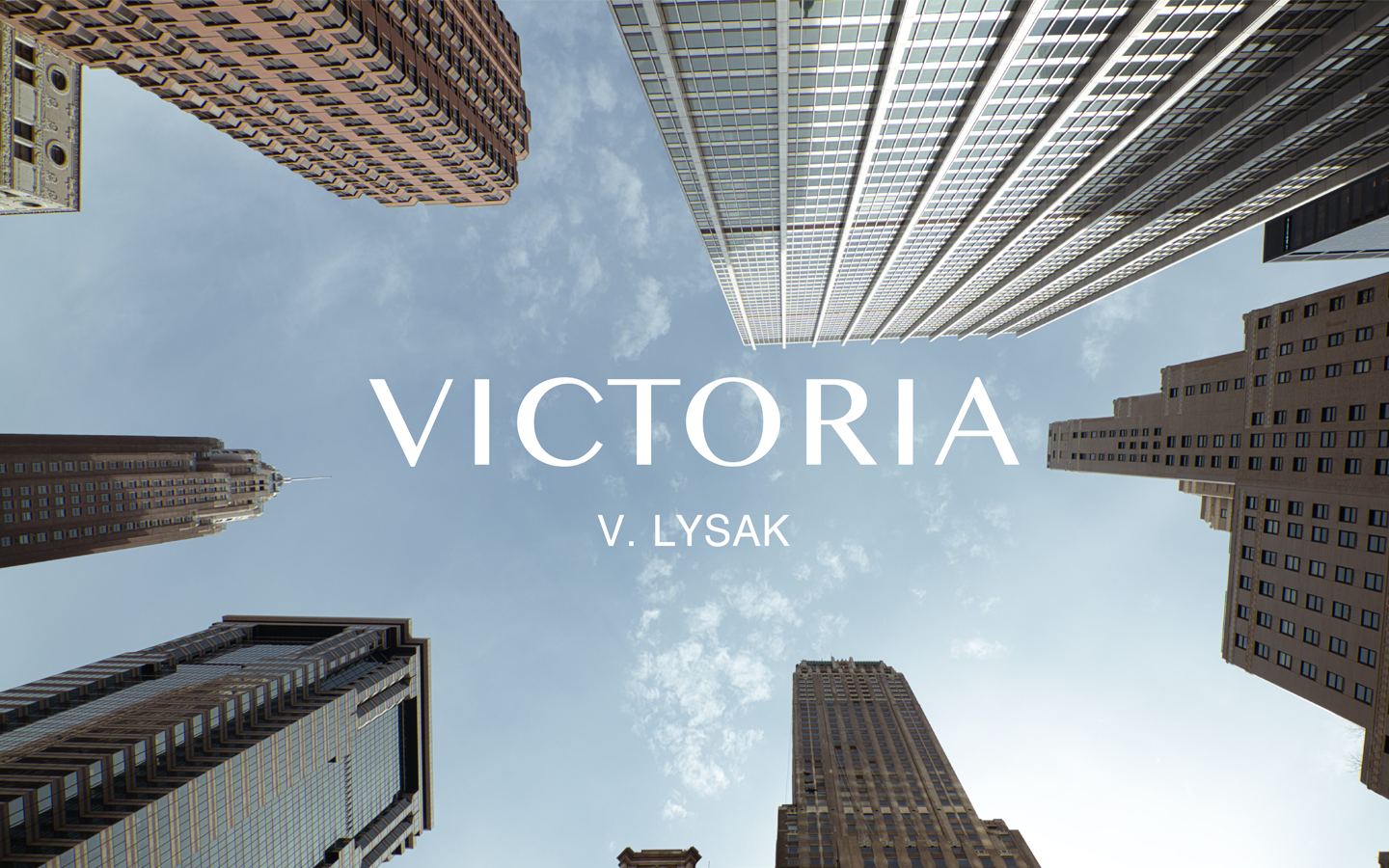
The Challenge/
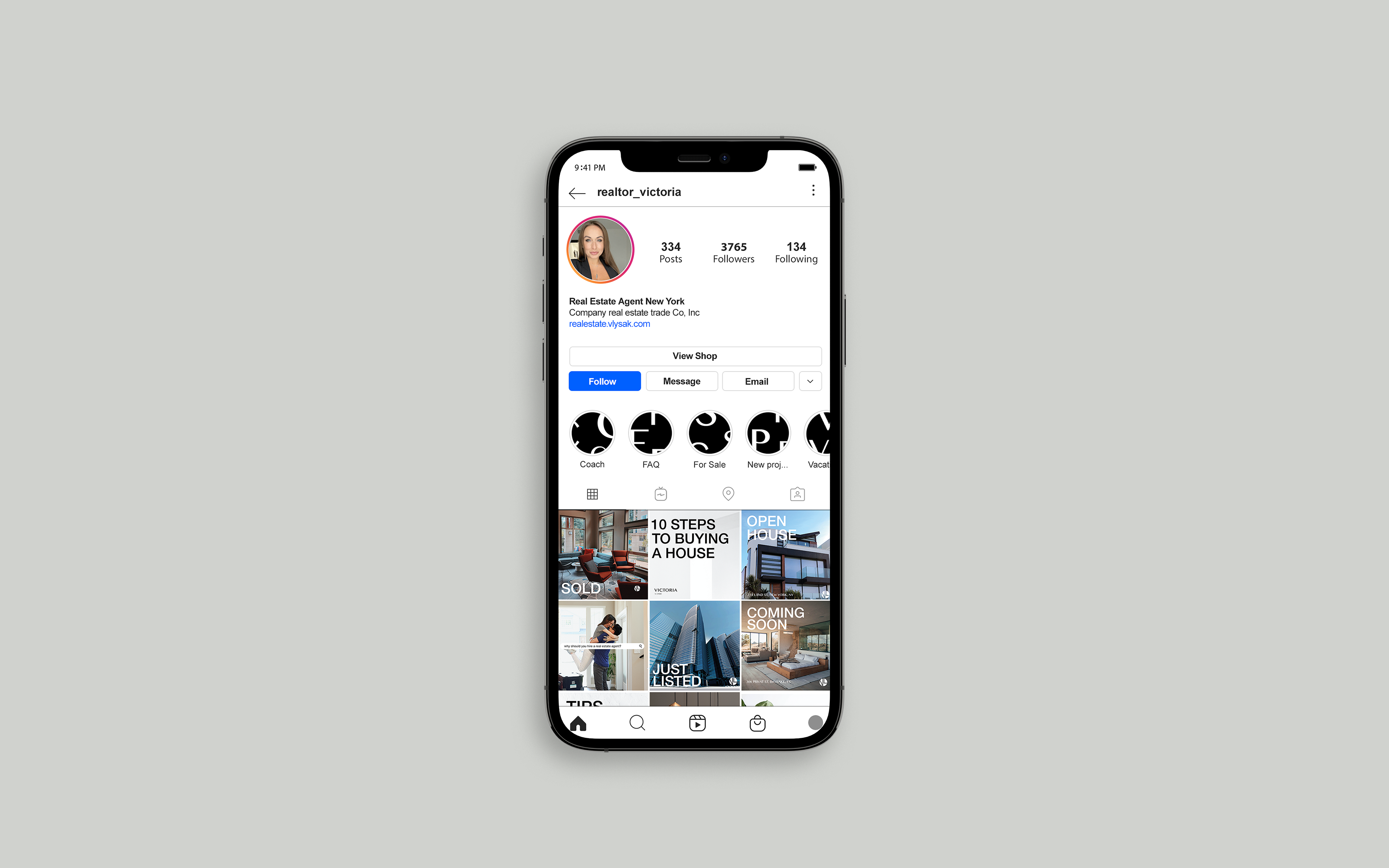
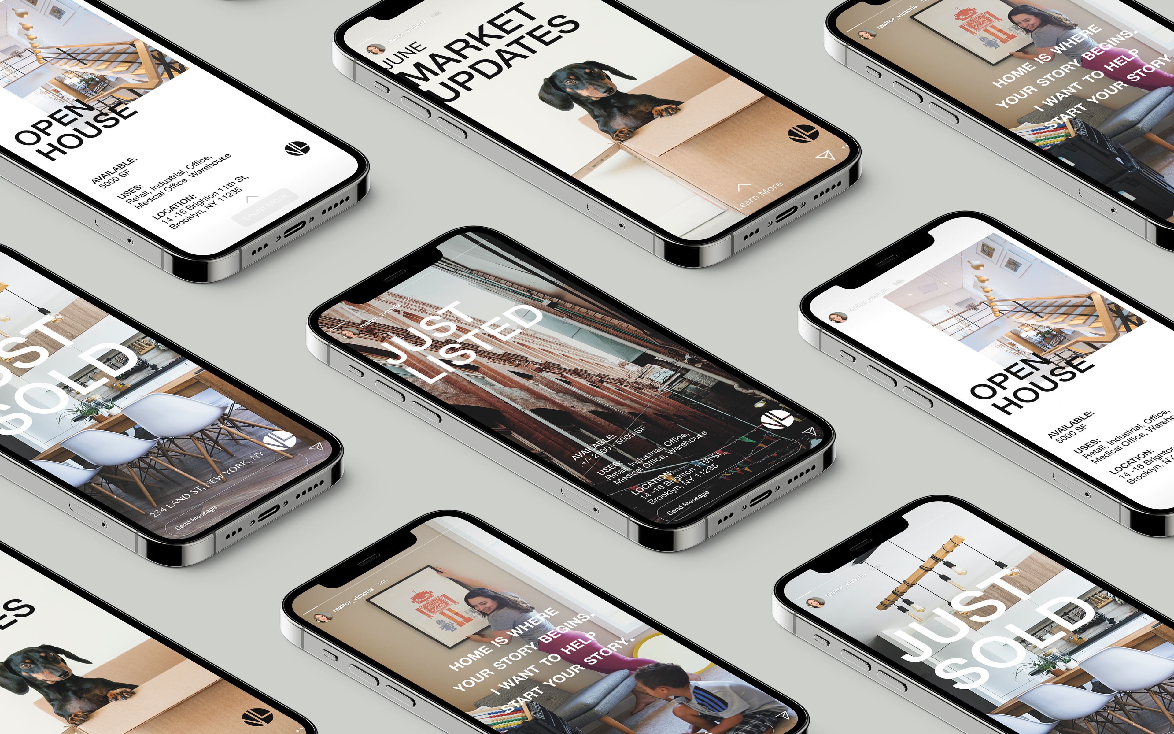
One of the challenges we faced was to emphasize the agent’s professionalism and attentiveness, keeping in mind her individuality. Since she specializes specifically in New York’s real estate market, we decided to render the spirit of the city through the prism of our customer’s brand.
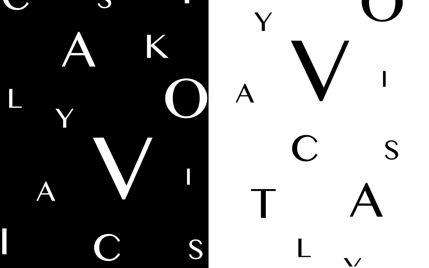
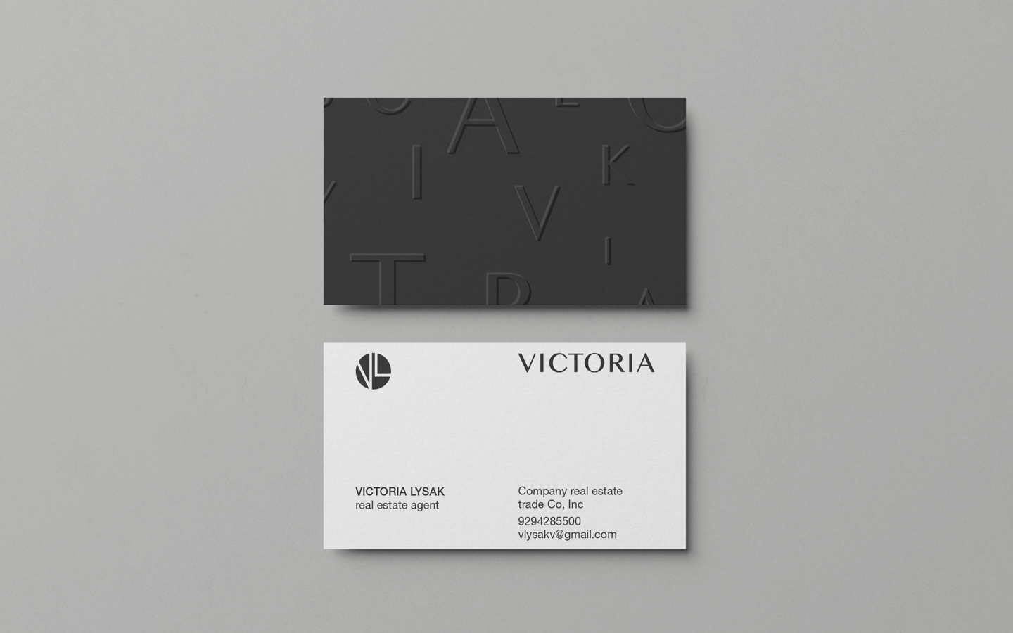
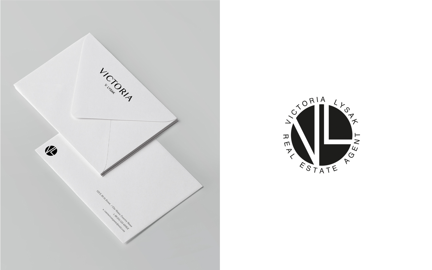
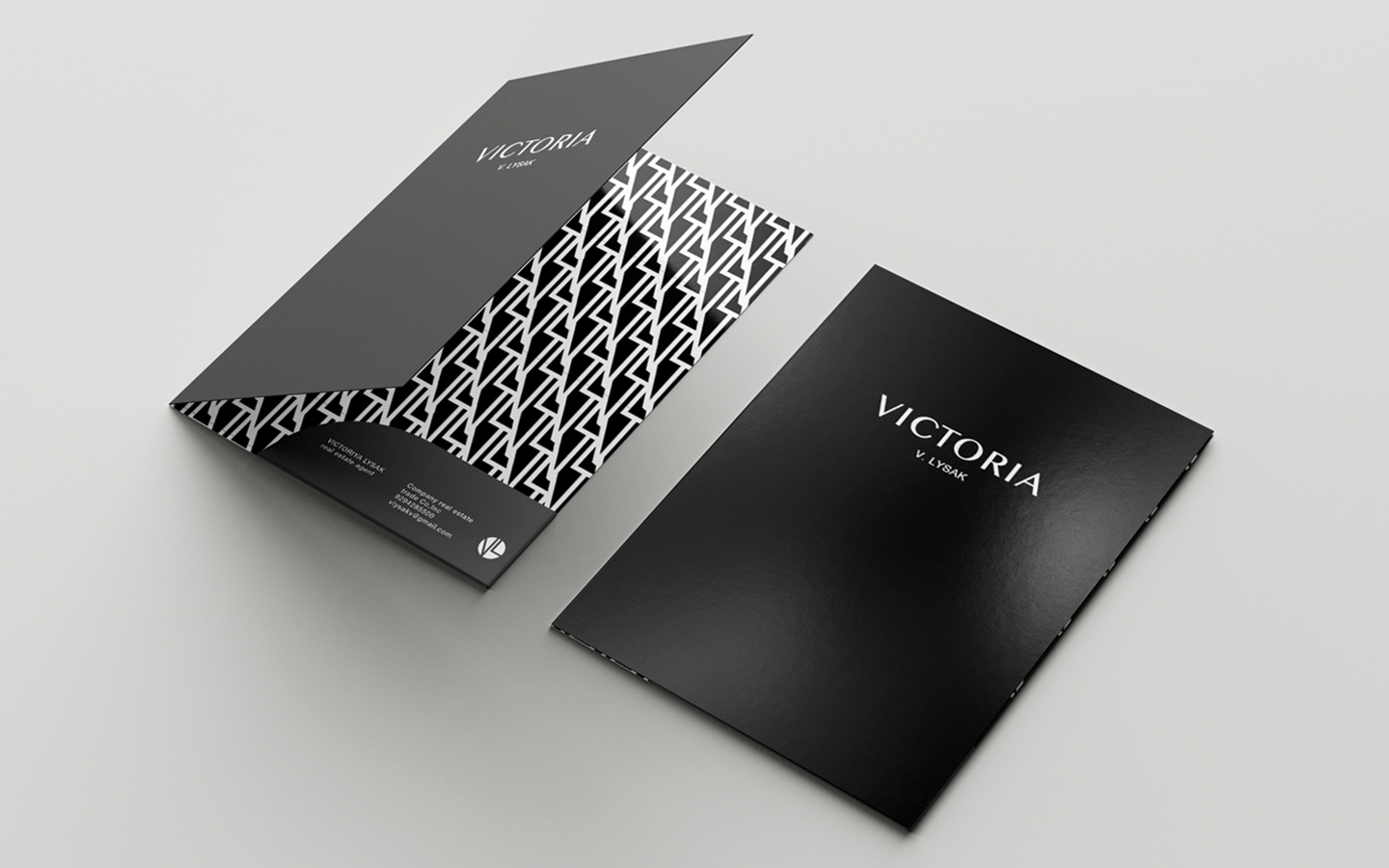
The Solution/
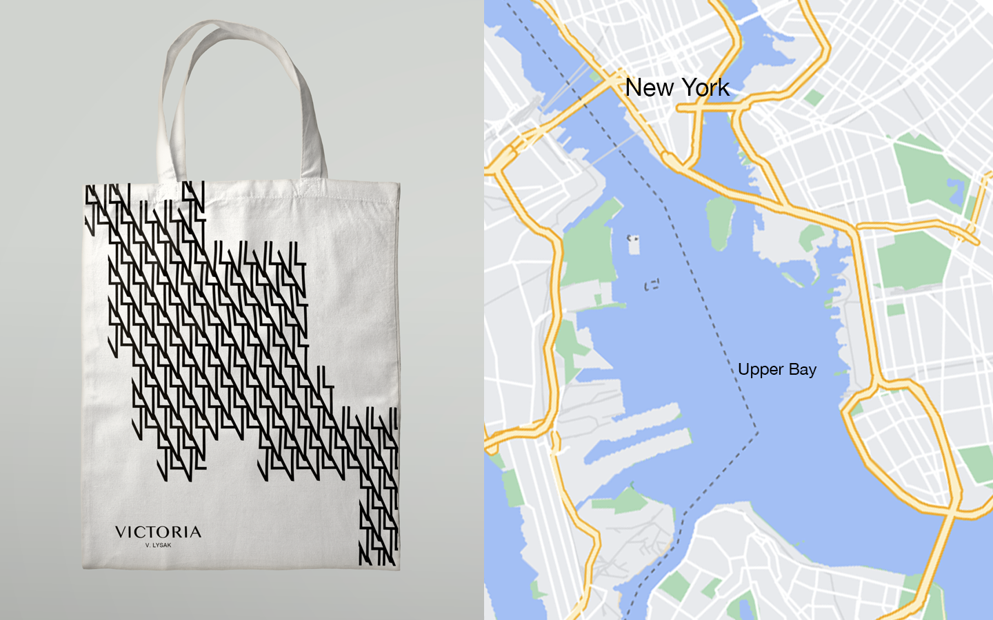
While our goal was to keep the design as light as possible for it to look fresh in New York’s surroundings, we wanted to get our inspiration from the city.
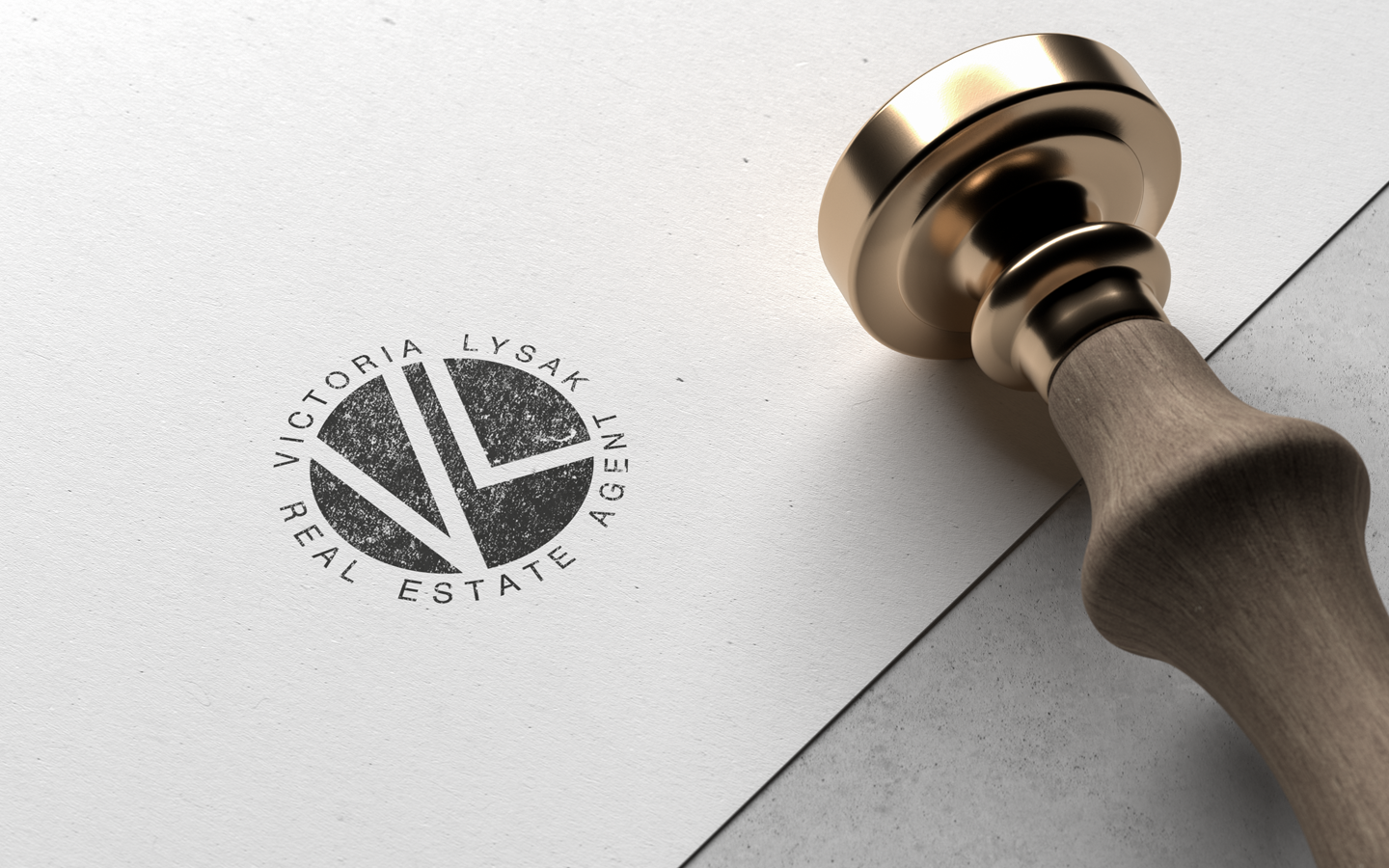
This can be seen in a monogram which was mostly inspired by the intricate architecture of the Flatiron Building, so we passed its outline, combined with the initials of the customer. Another great example would be a font choice: we picked Helvetica out of many as it is the most commonly known among New Yorkers.